5 tips for Product Styling
/Recently we did some product styling for Woman Rising Network - an online hub that strives to inspire, support and celebrate women in business across Australia. We designed a range of mini prints and inspirational cards for them last year and had the pleasure of working with them again to style their products and create content for their social media channels and website.
When it comes to photographing your products, styling plays an important role, so today I'm sharing with you my 5 quick tips for product styling.
5 Product Styling Tips:
1 - Natural Light
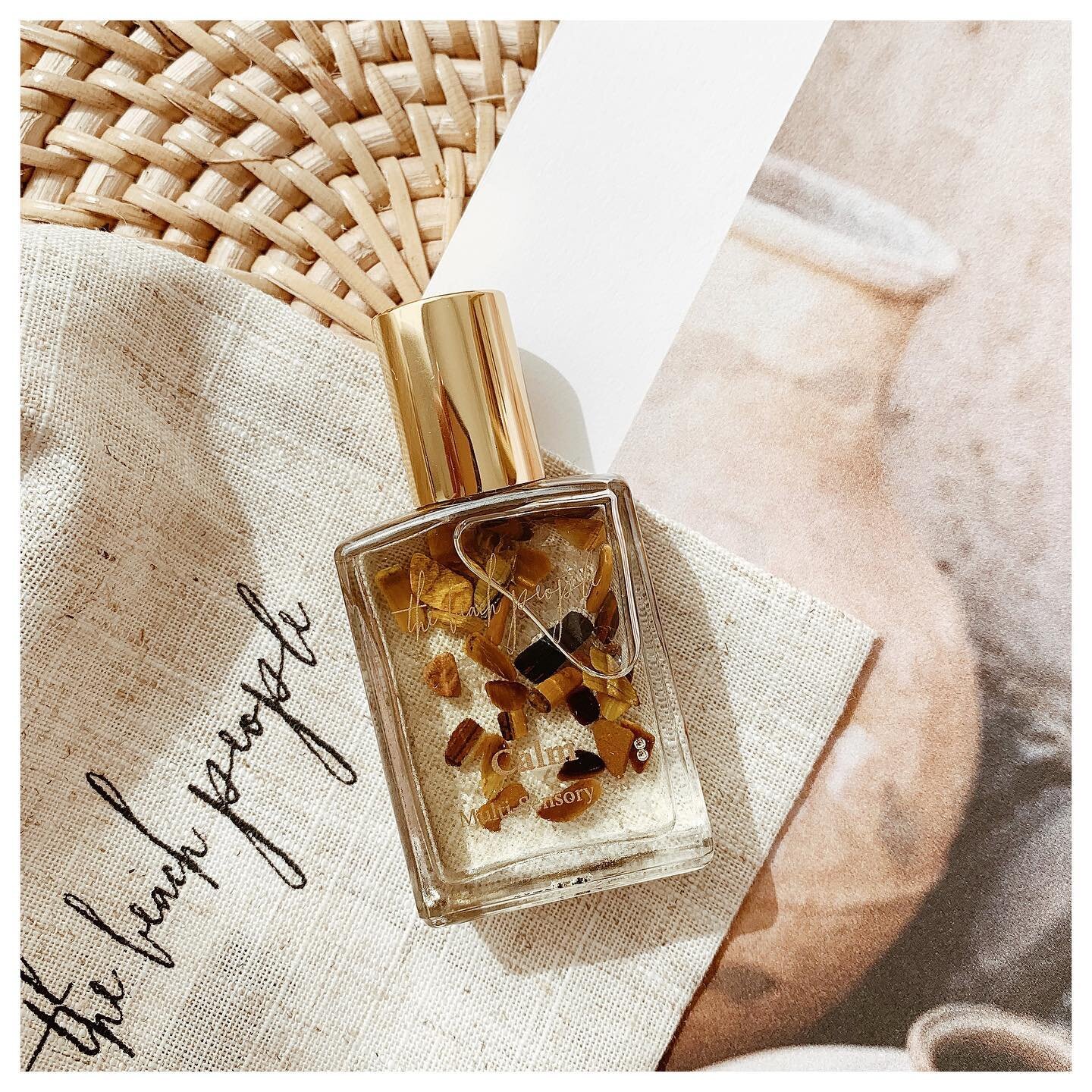
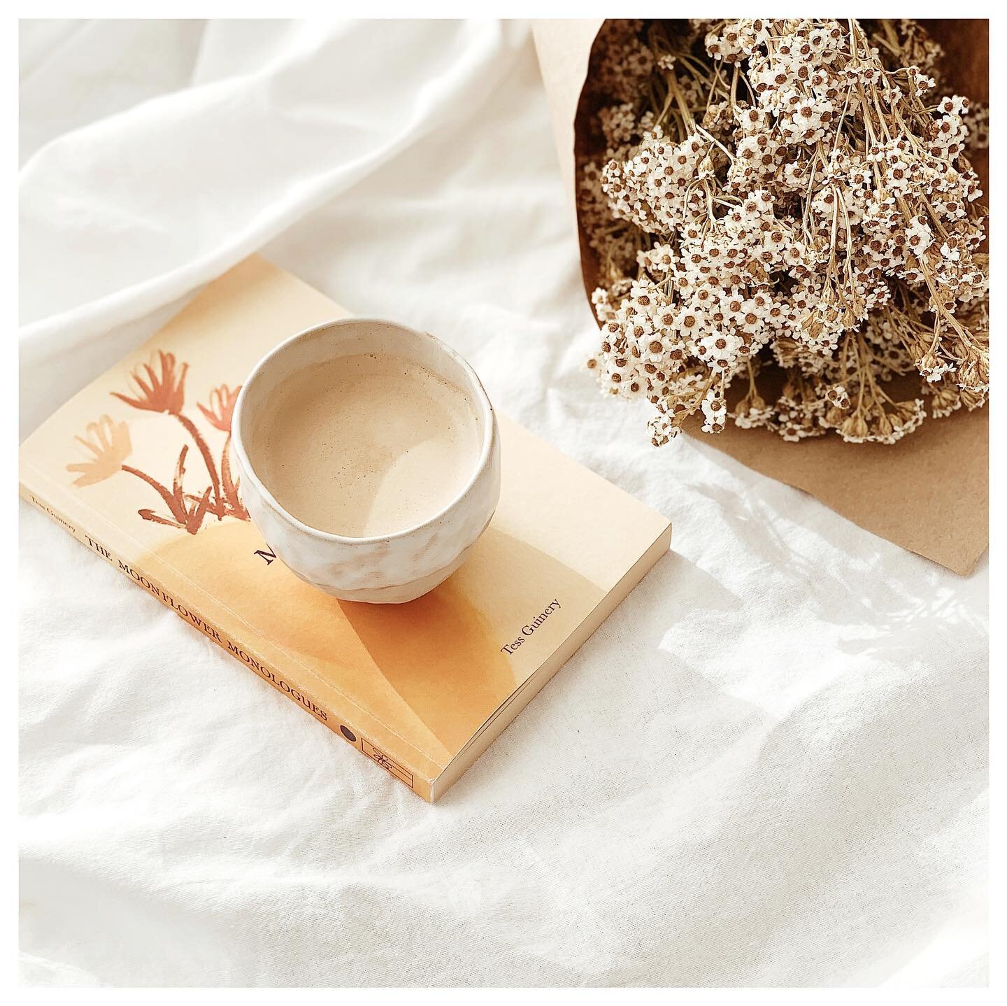
You've probably heard it before, but natural light is the most important thing for good quality images that are clear and bright, especially if you're not using equipment. Filtered light often works better as direct sunlight can be a little harsh and create unwanted shadows (unless that's the look you're going for!)
2. Stick to a rough colour scheme
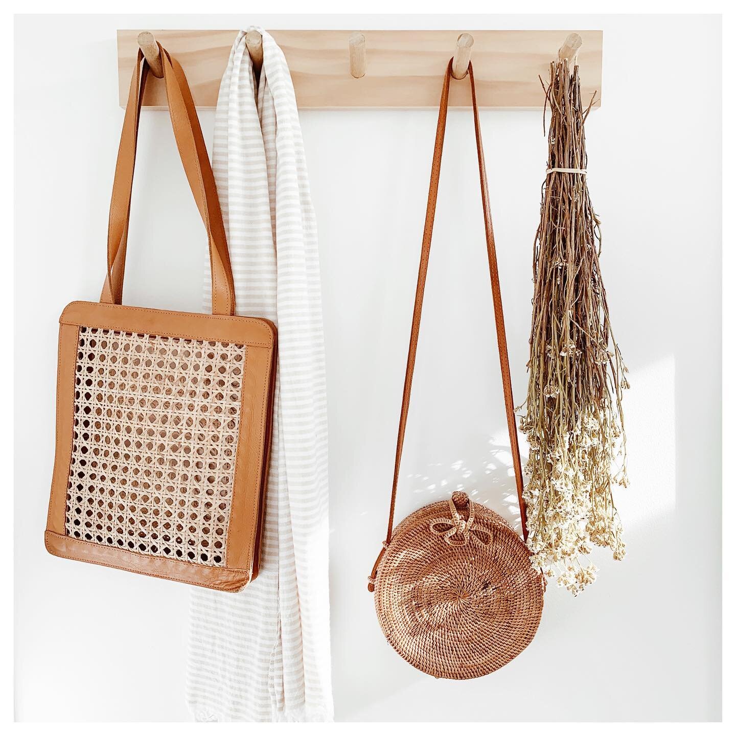
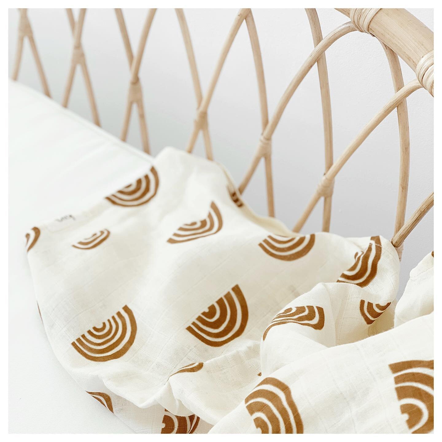
Create a colour palette based on your brand colours or products and stick to it (or slight variations of it) across all images. This will ensure the images are cohesive, not only with each other as a range, but also with your brand.
3. Mix up the angles
Get creative with the angles and composition to create some variation between each image. You don't want to include 10 flatlays of the same product, so experiment with images that are front or slightly side on, and mix it up with different depths of field.
4. Focus on the hero object
Keep your product the main focus of the image. There's nothing worse than someone confusing what you're actually selling with one of your props.
5. Add some life
Flowers or foliage are a great way to add some life to your images and create a fresh aesthetic. Try and stick with neutral colours or colours that compliment your product, so they don't create too much distraction.
And no matter what you're styling, make sure all your images are consistent in lighting and editing!


